Visualizations
Visualize enables you to create visualizations of the data in your Energy Logserver indices. You can then build dashboards that display related visualizations. Visualizations are based on Energy Logserver queries. By using a series of Energy Logserver aggregations to extract and process your data, you can create charts that show you the trends, spikes, and dips.
Creating visualization
Create
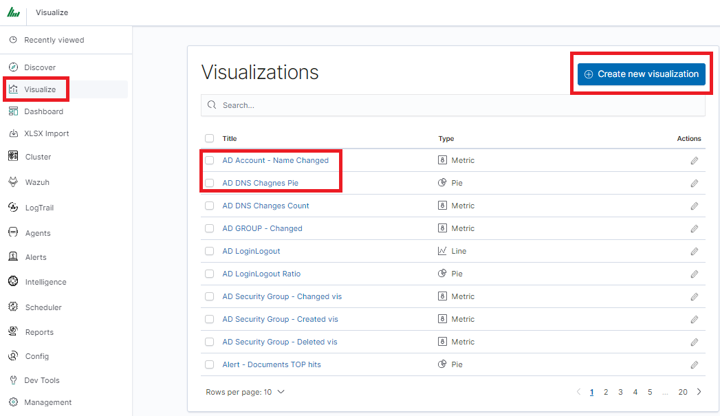
To create a visualization, go to the “Visualize” tab from the main menu. A new page will appear where you can create or load visualization.
Load
To load previously created and saved visualization, you must select it from the list.
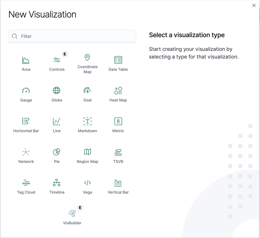
To create a new visualization, you should choose the preferred method of data presentation.
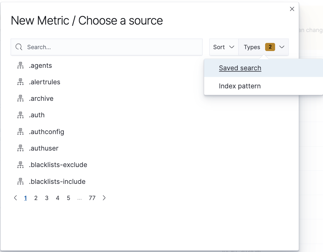
Next, specify whether the created visualization will be based on a new or previously saved query. If on a new one, select the index whose visualization should concern. If visualization is created from a saved query, you just need to select the appropriate query from the list, or (if there are many saved searches) search for them by name.
Visualization types
Before the data visualization will be created, first you have to choose the presentation method from an existing list. Currently, there are five groups of visualization types. Each of them serves different purposes. If you want to see only the current number of products sold, it is best to choose “Metric”, which presents one value.
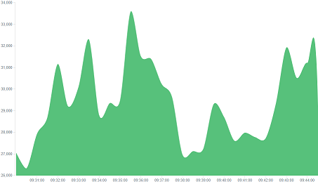
However, if we would like to see user activity trends on pages at different hours and days, a better choice will be the “Area chart”, which displays a chart with time division.
The “Globe” visualization displays geolocation data on a 3D globe. It maps events to countries or regions using ISO country codes derived from GeoIP fields. Use this visualization to identify the geographic distribution of network traffic, login attempts, or other location-based events. This visualization is available only with the SIEM Plan license.
The “Markdown widget” view is used to place text e.g. information about the dashboard, explanations, and instructions on how to navigate. Markdown language was used to format the text (the most popular use is GitHub). More information and instructions can be found at this link: https://docs.github.com/en/get-started/writing-on-github
Edit visualization and saving
Editing
Editing a saved visualization enables you to directly modify the object definition. You can change the object title, add a description, and modify the JSON that defines the object properties. After selecting the index and the method of data presentation, you can enter the editing mode. This will open a new window with an empty visualization.
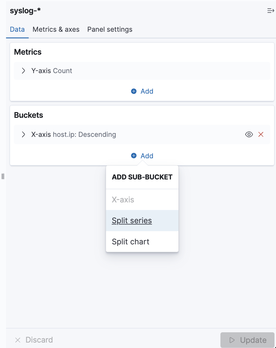
At the very top, there is a bar of queries that can be edited throughout the creation of the visualization. It works in the same way as in the “Discover” tab, which means searching the raw data, but instead of the data being displayed, the visualization will be edited. The following example will be based on the “Area chart”. The visualization modification panel on the left is divided into three tabs: “Data”, “Metric & Axes” and “Panel Settings”.
In the “Data” tab, you can modify the elements responsible for which data and how should be presented. In this tab, there are two sectors: “metrics”, in which we set what data should be displayed, and “buckets” in which we specify how they should be presented.
Select the Metrics & Axes tab to change the way each metric is shown on the chart. The data series are styled in the Metrics section, while the axes are styled in the X and Y axis sections.
In the “Panel Settings” tab, there are settings relating mainly to visual aesthetics. Each type of visualization has separate options.
To create the first graph in the char modification panel, in the “Data” tab we add X-Axis in the “buckets” sections. In “Aggregation” choose “Histogram”, in “Field” should automatically be located “timestamp” and “interval”: “Auto” (if not, set it accordingly). Click the Update button in the bottom right of the configuration panel. Your first graph should now appear.
Some of the options for “Area Chart” are:
Smooth Lines - is used to smooth the graph line.
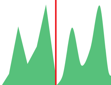
Current time marker – places a vertical line on the graph that determines the current time.
Set Y-Axis Extents – allows you to set minimum and maximum values for the Y axis, which increases the readability of the graphs. This is useful, if we know that the data will never be less than (the minimum value), or to indicate the goals of the company (maximum value).
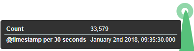
Show Tooltip – option for displaying the information window under the mouse cursor, after pointing to the point on the graph.
Saving
To save the visualization, click on the “Save” button under the query bar:
 give it a name and click the button
  .
.
Load Saved Visualization
To load a previously saved visualization, go to Stack Management → Saved Objects and filter by type “Visualizations”. Select the desired visualization from the list to open it.